Design Like an Architect: 7 Website Principles Every Life Coach Needs
Design Like an Architect: 7 Website Principles Every Life Coach Needs
Your website isn't just an online brochure—it's your digital office. It's where potential clients size you up, decide if they trust you, and ultimately decide whether they want to take up your offer.
The difference between a site that converts and one that doesn't often comes down to design principles that architects have used for centuries to create spaces that feel welcoming, functional, and inspiring.
Think about your reaction if you walked into the Cistern Chapel or sat down in the Sydney Opera House; you’d probably be amazed by the perfect angles, the uniform structures, and the shades of light that seem to blend perfectly.
Ok, we’re not building the next wonder of the world, but if you apply just a few of these design concepts to your website and clean up your copy, you’ll see a significant boost in both traffic and conversions.
Let's break down how to apply these timeless principles to build a coaching website that actually works.
Start With a Clear Entrance
Walk into any well-designed building and you immediately know where you are and where to go next.
Your homepage needs that same clarity—right at the top, before anyone scrolls any further.
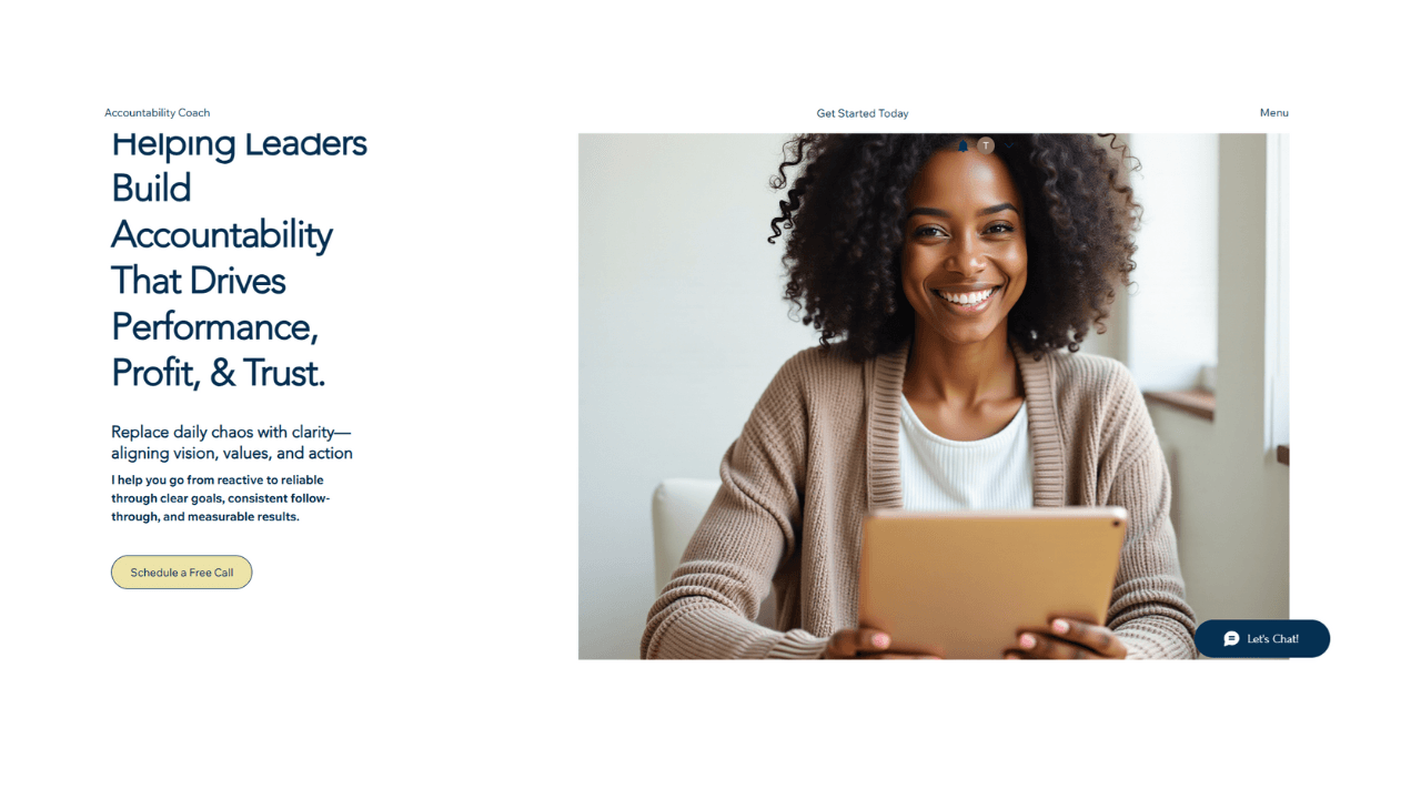
Your above-the-fold headline is your front door. It should tell visitors exactly who you help, what transformation you offer, and why it matters.
Pair it with a concise sub-headline and one clear call-to-action button. Use plenty of white space and a clean font to let the message sink in.
Take this example: "Helping Leaders Build Accountability That Drives Performance, Profit, & Trust."
It works because it names the audience (leaders), the outcome (accountability and performance), and the emotional payoff (trust). Within seconds, the right visitor knows they're in the right place.
As soon as someone lands on your website they should instantly know 3 things about your service
Who you help
How you can help them
The results they can achieve
Balance Creates Trust
Think about buildings that feel chaotic—ragged proportions, uneven materials, no visual balance. They make you feel uneasy. The same goes for websites.
Balance isn't about making everything perfect. It's about creating visual harmony between text, images, and white space so visitors can relax and focus.
Keep your font sizes, margins, and spacing consistent. If your brand feels professional and stable, lean into symmetry.
If it's creative and bold, asymmetry can work—but it still needs some kind of structure.
A balanced site helps visitors stay longer because they're not fighting against visual noise..
Guide People Through Your Story
Architects design corridors, staircases, and visuals to move people naturally through a space. Your website should do the same.
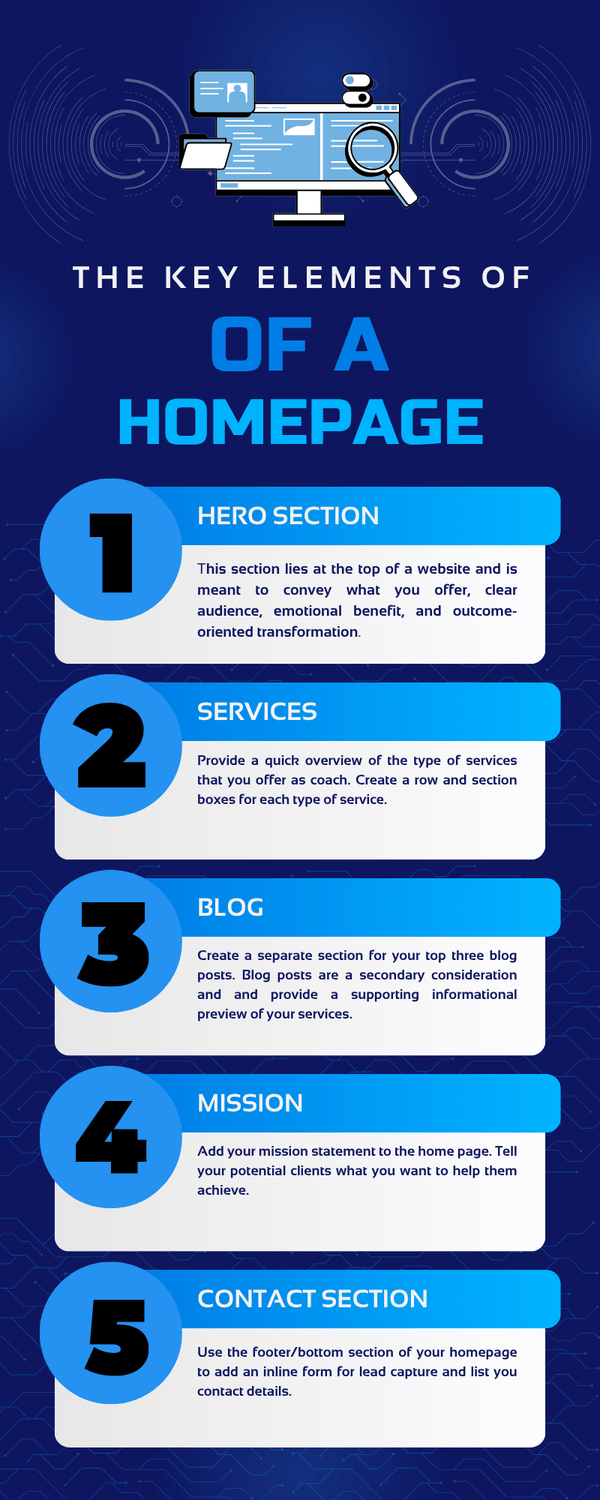
Arrange your homepage sections in a logical flow: start with your headline, move into services, share your mission or philosophy, showcase recent blog content, and end with a contact section.
Each piece should lead smoothly to the next. Place calls-to-action strategically—"Book a Call" or "Learn More"—to nudge visitors forward.
On mobile, this flow becomes even more critical. Test how your site scrolls and whether navigation feels intuitive on a smaller screen.
Make Your Core Message Unmissable
Every great building has a focal point—the grand staircase, the floor-to-ceiling window, the central courtyard. Your website needs one too.
Decide what you want visitors to remember most. Is it your core transformation? Your main offer?
Once you know, use simple visual hierarchy to make it unmissable: a large, bold headline, supporting text underneath, and a standout button.
Don't dilute your message by competing for attention. One dominant element per section is enough.
If your hero section says "Schedule a Free Call," let that be the star—everything else supports it
Use Contrast to Create Energy
Contrast in architecture—light against shadow, rough texture next to smooth—adds life and dimension.
On your website, contrast makes buttons pop, headlines stand out, and sections feel distinct.
Use colour strategically. If your background is light, your CTA button should be bold and with a dash of colour.
Alternate between light and dark sections as visitors scroll to create rhythm. Pair functional fonts for headers with simple, readable body text.
High contrast also improves readability, which keeps visitors engaged longer—a signal search engines like Google notice and reward.
Design for Growth and Mobile
Modern buildings are adaptable—they evolve as needs change. Your website should work the same way.
Start by ensuring every section is mobile-responsive. More than half your visitors will find you on their phones, so test how your homepage looks and functions on smaller screens.
Utilize sleek, modular design blocks that you can easily update as your business evolves—new services, fresh testimonials, and updated blog posts.
Your website isn't static. It's a living workspace that should grow alongside your coaching practice
Connect to Your Larger Ecosystem
Buildings don't exist in isolation—they fit into neighborhoods, landscapes, and ecosystems. Your website is the same.
Integrate it with your social profiles, Google Business Profile, email funnel, and CRM. Keep your colours, tone, and imagery consistent across every touchpoint.
Include a section that highlights your primary services. Add this section to your homepage so visitors know exactly what you offer.
Next, add a blog section below your services —not as the main content, but as a way to showcase expertise and improve search visibility.
Make it easy for people to reach you: full contact details in the footer, an inline form on the homepage, and one-tap access from mobile.
Large Call to Action Headline
At the end of the day, spaces are designed for people—not just aesthetics. Your site should make visitors feel calm, understood, and ready to take the next step.
Use warm, authentic imagery. Include a short mission statement or coaching philosophy section. Add testimonials that feel real, not polished to perfection. Make contact easy and inviting.
When balance, clarity, and human-centered design come together, visitors don't just browse—they stay, engage, and book.
Your website is more than code and pixels. It's the space where transformation begins.
Design it like you'd design a room where meaningful conversations happen—with intention, care, and a clear sense of purpose.
Watch this walkthrough video next, as I explain the purpose of
each section of the website and how you can optimize your own to boost traffic and conversions.


© All rights reserved